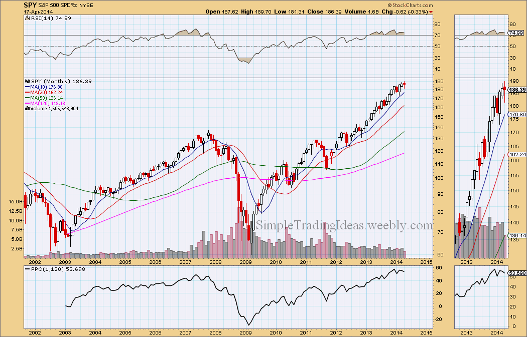
The monthly chart below shows SPY, the S&P 500 ETF with two indicators, RSI above the chart and PPO below the chart. RSI is overbought and there is a slight divergence, it has been moving lower while SPY was moving higher. PPO(1,120) tells us the price difference in percentage between the 1- period EMA and the 120-period EMA (10 years). The 1-month EMA is 53.698% higher than the 120-month EMA. PPO(1,120) has reached extreme levels, higher than back in 2007. Also notice that there is a slight divergence here too, PPO(1,120) failed to reach new highs.
0 Comments
A couple of things I want to briefly note about the weekly chart. RSI was overbought and has been moving lower since the beginning of this year even though SPY had higher highs. MACD is still below the signal line and the signal line is moving lower. ATR has been moving higher since the beginning of the year even though SPY has basically stalled.
The Vortex Indicator is a unique directional indicator. The Vortex Indicator shows volatility-adjusted posotive trend movement and volatility-adjasted negative trend movement. The indicator oscillates above/below 1. During an uptren +VI is above -VI and during a downtrend -VI is above +VI. During a consolidation +VI and -VI moves in a narrow range. As you can see on the daily chart below that's what happening for SPY, and we are waiting to find out which Vortex Indicator is going to move higher.
If you read my last couple of posts than you know that it wasn’t a surprise that the market moved lower during this week. This is of course not the end of the World but the way I see it the correction is not over yet. Next week we will possible see further decline. Corrections like this give a good opportunity to trade volatility, namely VIX. You can’t trade directly VIX but there are plenty of VIX derivatives available. The easiest thing is to buy VIX calls during a market decline. There were good entry points last week, now probably it would be too late. Good timing is almost always the most important part of a good trade. If you are in a VIX trade, don’t get too greedy, realistically set resistance levels. The daily chart below shows SPY with MACD and StochRSI indicators. Both indicators show a bearish bias. From the chart below it looks like the correction could take another week and a half. The Februaty low or the 200-day MA could be a support or maybe both.
Normally there is a high correlation between $DAX, the German Sock Index and $SPX, the S&P 500 Large Cap Index. The correlation coefficient is usually close to 1. Since the end of February they have been moving in opposite direction. Is $DAX going to follow $SPX higher or $SPX is going to fall with $DAX? We will see it soon.
$BPSPX is the S&P 500 Bullish Percen Index. It is a breadth indicator and is calculated from the number of stocks having Point & Figure buy signals within the index, in this case the S&P 500. If $BPSPX reaches new highs with the index, $SPX that's bullish. As you can see on the chart below $SPX reached new highs but $BPSPX failed to reach new highs. The chart below also shows that the 200-day moving average is curving down and both the 20-day and 50-day moving averages are below the 200-day moving average.
SPY, the S&P 500 SPDR has been moving higher since the beginning of February as you can see on the daily chart below. The Money Flow Index (MFI) above the chart moved into overbought territory. The Vortex Indicator (VTX) below the chart, a trend indicator shows that the trend is losing momentum. The green line is turning down.
$SPXA50R, the S&P 500 percent of stocks above their 50-day moving average seems to be stalled at the 40% area. In the fairly recent past $SPXA50R bounced back from this level several times as you can see it on the chart below and that would be bullish at least in the short term. In the background you can also see that these low levels correspond to short term bottoms on SPX, the S&P 500 large cap index chart.
The daily charts below shows the 9 sectors of the S&P 500. The strongest sectors are above their 20-day and 50-day simple moving average. A short-term pullback started during the past couple of days. The weakest sector is the utilities sector.
The 5 minute chart below shows that soon after 3:00 pm the market turned bullish with increased volume. It bounced back from the 200-period moving average like a tennis ball. An excited way to end 2013. Next year we will see if there is more room to go higher.
|
Loading
Search Site
Links
Archives
September 2014
Categories
All
|